Design systems
A design system is only as good as what actually gets built. I architect token-based systems that close the gap between design decisions and technical implementation, making visual quality something teams can share, maintain, and ship.
Case studies
Each case study walks through how I think about and build design systems, covering the four pillars of my approach: token architecture, library structure, distribution models, and documentation strategy. If you want to understand my process and the decisions behind it, you are in the right place. If you want to see this thinking applied to a real product, the case studies below show the Uniandes Design System and Zededa MCP in full detail.

My design system methodology
Tokens and themes
Global, semantic, component tokens
Tokens are the foundation of a design system, but they are also the layer that makes it AI-ready. A well-structured token architecture gives AI agents the context they need to build components autonomously or generate design playgrounds without losing consistency. I approach this with a three-tier architecture: global tokens that define the raw values, semantic tokens that assign meaning, and component tokens that apply decisions at the local level. This structure is the most flexible way to support multiple themes without multiplying complexity.
color

utility
yellow

100
#F9EFBB

200
#EFD242

300
#DBB305

400
#BE9304

500
#A57702

600
#8A5801

700
#6D3F00

800
#4B2C00

900
#2C1900
color
utility
green

100
#DCF3EE

200
#9FDFCF

300
#5DC9AF

400
#11AD86

500
#0E9070

600
#0B7058

700
#085442

800
#063A2E

900
#03211A
color

utility
red

100
#FCEAEF

200
#F8C5D1

300
#EFA2B2

400
#DD7C88

500
#CD5A61

600
#B82F30

700
#8D2121

800
#631717

900
#390E0E
Tier 1
Core definition
color

brand
pink

100
#FEE1E3

200
#F88A9B

300
#F06182

400
#E63B70

500
#D31B5C

600
#A6154F

700
#78103E

800
#4B0A2A

900
#1E0412
color
brand
cream

100
#FAF7F0

200
#F8F3E9

300
#F5EFE2

400
#F3EBDC

500
#F1E8D7

600
#D5CEBF

700
#B9B4A7

800
#9C998F

900
#807E77
color
dataviz

orange
#F89C52

purple
#798DE3

pink-transparent-12
#E63B70, 12%
Tier 1
Theme definition
semantic

color
background

default
color/neutral/white

default-hover
color/neutral/100

subtle
color/neutral/100

subtle-hover
color/neutral/200

knockout
color/neutral/black

disabled
color/neutral/200

brand
color/brand/gray/100

brand-hover
color/brand/gray/200

brand-disabled
color/neutral/200

brand-knockout
color/brand/gray/800

brand-knockout-hover
color/brand/gray/700

transparent
color/transparent/25

transparent
color/transparent/90

utility/error
color/utility/red/100

utility/error-knockout
color/utility/red/600

utility/warning
color/utility/yellow/100

utility/warning-knockout
color/utility/yellow/600

utility/success
color/utility/green/100

utility/success-knockout
color/utility/green/600

utility/info
color/utility/blue/100

utility/info-knockout
color/utility/blue/600

dataviz/primary
color/brand/gray/600

dataviz/primary-subtle
color/transparent/25

dataviz/secondary
color/neutral/200

dataviz/tertiary
color-neutral/400
Tier 2
Semantic definition
button

color
background

default
color/neutral/white

hover
color/neutral/white

active
color/neutral/white

disabled
color/neutral/white
button
color
content

default
color/neutral/900

hover
color/neutral/900

active
color/neutral/900

disabled
color/neutral/600
button
color
border

default
color/neutral/900

hover
color/neutral/900

active
color/neutral/900

disabled
color/neutral/600
button
primary
color
background

default
color/neutral/700

hover
color/neutral/800

active
color/neutral/800

disabled
color/neutral/200
button
primary
color
content

default
color/neutral/white

hover
color/neutral/white

active
color/neutral/white

disabled
color/neutral/white
button
primary
color
border

default
color/neutral/700

hover
color/neutral/800

active
color/neutral/800

disabled
color/neutral/200
Tier 3
Component definition
Libraries
Structure, audience, purpose
How a library is structured depends on who is going to use it. Before defining any structure I ask: is this system primarily for other design teams, for developers, for an internal team, or for non-designers? Each answer leads to a different library model. Sometimes one library is enough. Often the right solution is multiple libraries with distinct purposes, each optimized for the people consuming it, so that the system adapts to how people actually work rather than asking them to adapt to it.
Core Design system files (Figma)
Multi-theme design tokens
1
Core components
2
Interaction patterns
3


Product specific files (Figma)
Feature 1
Feature 2
Feature 3
Marketing page
Specific product components
Local patterns

Distribution and governance
Centralized, federated, hybrid
A design system is only as good as the process behind it. Distribution means understanding how many teams are consuming the system and through what channels. Governance means defining who can propose new components, what the review process looks like, and who has the final say. I also define the model of the system itself: centralized, federated, or hybrid, depending on the size of the organization and the autonomy of its teams.
Solitary (Initiative)

Product team 1
Marketing team
Product team 2
Product team 3

Only contributor
Centralized (Core team)
Product team 1
Marketing team
Product team 2
Product team 3
Dedicated team
Federated (Community)

Product team 1
Marketing team
Product team 2
Product team 3


Anyone can contribute
Clear documentation
Audience, structure, accessibility
Documentation is where design systems fail most often. The question is not just where it lives, but who it is written for. Developers need different information than designers, and non-designers need something different again. I approach documentation as a design problem: the right content, structured for the right audience, in the place where they are most likely to look for it.
Buenas prácticas
La guía de uso describe las buenas prácticas al usar los iconos.
DO
Respetar el contenedor del icono


DON'T
Tapar el contendor del icono


DO
Ajustar los iconos a la grilla

DON'T
Alinear con otras coordenadas

Ej.
Alinear un icono en la coordenada x = 10.8
Accesibilidad
DO
Dar un touch target apropiado

DON'T
No dar suficiente espacio para touch

DO
Usar grado low para fondos oscuros

DON'T
No usar grado low para fondos oscuros

Usar un grado adecuado evita que se genere un efecto visual en donde los iconos se ven más gruesos cuando se ponen sobre un fondo oscuro. La librería de material design ya viene optimizada para estas situaciones.
Guía de uso en Dev Mode
Para la inspección de iconos de los diferentes componentes en el Dev Mode de Figma puede seguir los siguientes pasos para configurar los iconos en los diferentes estilos.
Si es necesario descargar la tipografía de los iconos la pueden encontrar en este link:
Outline .woff2: material-design-icons/variablefont/MaterialSymbolsOutlined[FILL,GRAD,opsz,wght].woff2 at master · google/material-design-icons · GitHub
Paso 1 Parámetros de configuración del icono
Ir al panel izquierdo y encontrar la capa “PlaceholderIcon” como se ve en la siguiente imagen.
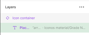
Debe escoger esta capa. Es la capa que está dentro de Icon container

En el panel de la derecha va a encontrar la sección de Typography que le permite ver los parámetros con los cuales está configurado el icono que selecciono.
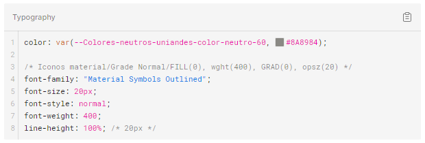

Este texto corresponde a los parámetros de los iconos que se pueden configurar desde el CSS y que corresponden al icono seleccionado.

Paso 3 Ver el nombre del icono
En el panel de la derecha va a encontrar la sección de Content que le permite ver el nombre del icono.
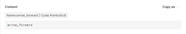


Este es el codepoint con el que se puede llamar al icono
Este código es el mismo que se usa para llamar al icono de la fuente tipográfica de Material
Variantes (uso)
Este componente tendrá diferentes variantes, cuyas características se explican a continuación.
Type
Se refiere a la categoría del componente, cada una prioriza distintos atributos del tipo de contenido. Los atributos que tienen * serán obligatorios para la variante correspondiente. El atributo ‘Fecha Fin (Día/Mes)’ sólo será visible cuando el evento no inicie y termine el mismo día.
- Grid:

00
ENE
arrow_downward
00
ENE
Título del Evento
El Centro Cultural de la Decanatura de Estudiantes (DECA) de la Universidad de los Andes tiene el honor de invitarle al concierto de Arsen Petrosyan, uno de los intérpretes contemporáneos más destacados del duduk armenio, un instrumento con siglos de historia y tradición.
access_time
0:00 PM
location_pin
Lugar
ESTADO DEL EVENTO

1
2

3
6
4
8
5
7
1
Imagen*
2
Fecha Inicio (Día/Mes)*
3
Fecha Fin (Día/Mes)
4
Título del Evento*
5
Descripción*
6
Hora inicio (12H)*
7
Lugar*
8
Estado del Evento*
- Row:
1
4

3

7
5
9
8
6
00
ENE
arrow_downward
00
ENE
estado de evento
Tag evento
Título del Evento
access_time
0:00 PM
location_pin
Lugar
facultad de ciencias sociales
1
Fecha Inicio (Día/Mes)*
2
Fecha Fin (Día/Mes)
4
Estado del Evento*
5
Tipo de Evento*
6
Título del Evento*
7
Hora inicio (12H)*
8
Dependencia/ Facultad*
Source Sans 3/Desktop/ss3-title-700
Font
Source Sans 3
Weight
Bold
Size
48px
Line Height
56px
Letter Spacing
-2%
Text Decoration
None
Paragraph Spacing
0px
Case
Original
The quick brown fox jumps over the lazy dog.
Source Sans 3/Desktop/ss3-title-300
Font
Source Sans 3
Weight
Light
Size
48px
Line Height
56px
Letter Spacing
-2%
Text Decoration
None
Paragraph Spacing
0px
Case
Original
The quick brown fox jumps over the lazy dog.
Colores
Colores neutros
Sitio Institucional
uniandes-color-neutro-90
rgba(77,77,76,1.00)
hsla(60,1,30,1.00)
#4D4D4C
uniandes-color-neutro-80
rgba(97,97,96,1.00)
hsla(60,1,38,1.00)
#616160
uniandes-color-neutro-70
rgba(115,114,109,1.00)
hsla(50,3,44,1.00)
#73726D
uniandes-color-neutro-60
rgba(138,137,132,1.00)
hsla(50,2,53,1.00)
#8A8984
uniandes-color-neutro-50
rgba(186,185,179,1.00)
hsla(51,5,72,1.00)
#BAB9B3
uniandes-color-neutro-40
rgba(224,223,218,1.00)
hsla(50,9,87,1.00)
#E0DFDA
uniandes-color-neutro-30
rgba(245,245,242,1.00)
hsla(60,13,95,1.00)
#F5F5F2
uniandes-color-neutro-20
rgba(252,252,250,1.00)
hsla(60,25,98,1.00)
#FCFCFA
Light Background/Colores principales
Sitio Institucional
uniandes-color-brand-white
rgba(255,255,255,1.00)
hsla(0,0,100,1.00)
#FFFFFF
uniandes-color-brand-black
rgba(25,25,22,1.00)
hsla(60,6,9,1.00)
#191916
Light Background/Colores de texto
Sitio Institucional
uniandes-color-primarytext-lightbg
rgba(31,31,28,1.00)
hsla(60,5,12,1.00)
#1F1F1C
uniandes-color-secondarytext-lightbg
rgba(89,89,89,1.00)
hsla(0,0,35,1.00)
#595959
uniandes-color-disabledtext-lightbg
rgba(116,116,116,1.00)
hsla(0,0,45,1.00)
#747474
uniandes-color-linktext-lightbg
rgba(36,66,178,1.00)
hsla(227,66,42,1.00)
#2442B2
uniandes-color-linktext-visited-lightbg
rgba(85,26,139,1.00)
hsla(271,68,32,1.00)
#551A8B
Light Background/Colores semánticos
Sitio Institucional
uniandes-color-success-lightbg
rgba(9,93,13,1.00)
hsla(123,82,20,1.00)
#095D0D
uniandes-color-alert-lightbg
rgba(229,134,23,1.00)
hsla(32,82,49,1.00)
#E58617
uniandes-color-error-lightbg
rgba(169,20,47,1.00)
hsla(349,79,37,1.00)
#A9142F
Light Background/Colores de background
Sitio Institucional
uniandes-color-primarybackground-lightbg
rgba(247,246,240,1.00)
hsla(51,30,95,1.00)
#F7F6F0
uniandes-color-secondarybackground-lightbg
rgba(252,252,250,1.00)
hsla(60,25,98,1.00)
#FCFCFA
Light Background/Colores secundarios
Sitio Institucional
uniandes-color-secondary-01-lightbg
rgba(255,228,30,1.00)
hsla(53,100,56,1.00)
#FFE41E
uniandes-color-secondary-02-lightbg
rgba(255,241,139,1.00)
hsla(53,100,77,1.00)
#FFF18B
Dark Background/Colores de texto
Sitio Institucional
uniandes-color-linktext-darkbg
rgba(124,160,219,1.00)
hsla(217,57,67,1.00)
#7CA0DB
uniandes-color-linktext-visited-darkbg
rgba(174,107,235,1.00)
hsla(271,76,67,1.00)
#AE6BEB
uniandes-color-primarytext-darkbg
rgba(252,252,250,1.00)
hsla(60,25,98,1.00)
#FCFCFA
uniandes-color-secondarytext-darkbg
rgba(164,164,164,1.00)
hsla(0,0,64,1.00)
#A4A4A4
uniandes-color-disabledtext-darkbg
rgba(118,118,118,1.00)
hsla(0,0,46,1.00)
#767676
Dark Background/Colores semánticos
Sitio Institucional
uniandes-color-success-darkbg
rgba(121,219,125,1.00)
hsla(122,58,67,1.00)
#79DB7D
uniandes-color-alert-darkbg
rgba(245,173,88,1.00)
hsla(32,89,65,1.00)
#F5AD58
uniandes-color-error-darkbg
rgba(245,152,169,1.00)
hsla(349,82,78,1.00)
#F598A9
Dark Background/Colores de background
Sitio Institucional
uniandes-color-primarybackground-darkbg
rgba(51,51,49,1.00)
hsla(60,2,20,1.00)
#333331
uniandes-color-secondarybackground-darkbg
rgba(76,76,76,1.00)
hsla(0,0,30,1.00)
#4C4C4C
Dark Background/Colores secundarios
Sitio Institucional
uniandes-color-secondary-01-darkbg
rgba(255,228,30,1.00)
hsla(53,100,56,1.00)
#FFE41E
uniandes-color-secondary-02-darkbg
rgba(255,241,139,1.00)
hsla(53,100,77,1.00)
#FFF18B
Light Background/Interactive Background/Primary
Sitio Institucional
background-primary-default-lightbg
{Colores/Light Background/Colores principales/uniandes-color-brand-black}
rgba(25,25,22,1.00)
hsla(60,6,9,1.00)
#191916
background-primary-hover-lightbg
{Colores/Light Background/Colores secundarios/uniandes-color-secondary-01-lightbg}
rgba(255,228,30,1.00)
hsla(53,100,56,1.00)
#FFE41E
Name
Variable Title
RGBA
HSLA
Hex
background-primary-disabled-lightbg
{Colores/Colores neutros/uniandes-color-neutro-40}
rgba(224,223,218,1.00)
hsla(50,9,87,1.00)
#E0DFDA
Light Background/Interactive Background/Secondary
Sitio Institucional
background-secondary-hover-lightbg
{Colores/Colores neutros/uniandes-color-neutro-50}
rgba(186,185,179,1.00)
hsla(51,5,72,1.00)
#BAB9B3
Name
Variable Title
RGBA
HSLA
Hex
background-secondary-selected-lightbg
{Colores/Colores neutros/uniandes-color-neutro-90}
rgba(77,77,76,1.00)
hsla(60,1,30,1.00)
#4D4D4C
Light Background/Interactive Background/Tertiary
Sitio Institucional
background-tertiary-hover-lightbg
{Colores/Colores neutros/uniandes-color-neutro-30}
rgba(245,245,242,1.00)
hsla(60,13,95,1.00)
#F5F5F2
Name
Variable Title
RGBA
HSLA
Hex
Light Background/Interactive Content/Primary
Sitio Institucional
content-primary-default-lightbg
{Colores/Dark Background/Colores de texto/uniandes-color-primarytext-darkbg}
rgba(252,252,250,1.00)
hsla(60,25,98,1.00)
#FCFCFA
content-primary-hover-lightbg
{Colores/Light Background/Colores de texto/uniandes-color-primarytext-lightbg}
rgba(31,31,28,1.00)
hsla(60,5,12,1.00)
#1F1F1C
content-primary-focus-lightbg
{Colores/Light Background/Colores de texto/uniandes-color-primarytext-lightbg}
rgba(31,31,28,1.00)
hsla(60,5,12,1.00)
#1F1F1C
content-primary-disabled-lightbg
{Colores/Colores neutros/uniandes-color-neutro-90}
rgba(77,77,76,1.00)
hsla(60,1,30,1.00)
#4D4D4C
Light Background/Interactive Content/Secondary
Sitio Institucional
content-secondary-default-lightbg
{Colores/Light Background/Colores de texto/uniandes-color-primarytext-lightbg}
rgba(31,31,28,1.00)
hsla(60,5,12,1.00)
#1F1F1C
content-secondary-hover-lightbg
{Colores/Light Background/Colores de texto/uniandes-color-primarytext-lightbg}
rgba(31,31,28,1.00)
hsla(60,5,12,1.00)
#1F1F1C
content-secondary-focus-lightbg
{Colores/Light Background/Colores de texto/uniandes-color-primarytext-lightbg}
rgba(31,31,28,1.00)
hsla(60,5,12,1.00)
#1F1F1C
content-secondary-disabled-lightbg
{Colores/Colores neutros/uniandes-color-neutro-70}
rgba(115,114,109,1.00)
hsla(50,3,44,1.00)
#73726D
content-secondary-selected-lightbg
{Colores/Dark Background/Colores de texto/uniandes-color-primarytext-darkbg}
rgba(252,252,250,1.00)
hsla(60,25,98,1.00)
#FCFCFA
Light Background/Interactive Content/Tertiary
Sitio Institucional
content-tertiary-default-lightbg
{Colores/Light Background/Colores de texto/uniandes-color-primarytext-lightbg}
rgba(31,31,28,1.00)
hsla(60,5,12,1.00)
#1F1F1C
content-tertiary-hover-lightbg
{Colores/Light Background/Colores de texto/uniandes-color-primarytext-lightbg}
rgba(31,31,28,1.00)
hsla(60,5,12,1.00)
#1F1F1C
content-tertiary-focus-lightbg
{Colores/Light Background/Colores de texto/uniandes-color-primarytext-lightbg}
rgba(31,31,28,1.00)
hsla(60,5,12,1.00)
#1F1F1C
content-tertiary-disabled-lightbg
{Colores/Colores neutros/uniandes-color-neutro-70}
rgba(115,114,109,1.00)
hsla(50,3,44,1.00)
#73726D
Light Background/Interactive Border/Primary
Sitio Institucional
border-primary-hover-lightbg
{Colores/Light Background/Colores principales/uniandes-color-brand-black}
rgba(25,25,22,1.00)
hsla(60,6,9,1.00)
#191916
border-primary-focus-lightbg
{Colores/Colores neutros/uniandes-color-neutro-90}
rgba(77,77,76,1.00)
hsla(60,1,30,1.00)
#4D4D4C
Light Background/Interactive Border/Secondary
Sitio Institucional
border-secondary-default-lightbg
{Colores/Light Background/Colores principales/uniandes-color-brand-black}
rgba(25,25,22,1.00)
hsla(60,6,9,1.00)
#191916
border-secondary-hover-lightbg
{Colores/Light Background/Colores principales/uniandes-color-brand-black}
rgba(25,25,22,1.00)
hsla(60,6,9,1.00)
#191916
border-secondary-focus-lightbg
{Colores/Light Background/Colores principales/uniandes-color-brand-black}
rgba(25,25,22,1.00)
hsla(60,6,9,1.00)
#191916
border-secondary-disabled-lightbg
{Colores/Colores neutros/uniandes-color-neutro-70}
rgba(115,114,109,1.00)
hsla(50,3,44,1.00)
#73726D
border-secondary-selected-lightbg
{Colores/Light Background/Colores principales/uniandes-color-brand-black}
rgba(25,25,22,1.00)
hsla(60,6,9,1.00)
#191916
Light Background/Interactive Border/Tertiary
Sitio Institucional
border-tertiary-hover-lightbg
{Colores/Light Background/Colores principales/uniandes-color-brand-black}
rgba(25,25,22,1.00)
hsla(60,6,9,1.00)
#191916
border-tertiary-focus-lightbg
{Colores/Colores neutros/uniandes-color-neutro-50}
rgba(186,185,179,1.00)
hsla(51,5,72,1.00)
#BAB9B3
Dark Background/Interactive Background/Pimary
Sitio Institucional
background-primary-default-darkbg
{Colores/Colores neutros/uniandes-color-neutro-20}
rgba(252,252,250,1.00)
hsla(60,25,98,1.00)
#FCFCFA
background-primary-hover-darkbg
{Colores/Dark Background/Colores secundarios/uniandes-color-secondary-01-darkbg}
rgba(255,228,30,1.00)
hsla(53,100,56,1.00)
#FFE41E
background-primary-focus-darkbg
{Colores/Dark Background/Colores secundarios/uniandes-color-secondary-02-darkbg}
rgba(255,241,139,1.00)
hsla(53,100,77,1.00)
#FFF18B
background-primary-disabled-darkbg
{Colores/Colores neutros/uniandes-color-neutro-90}
rgba(77,77,76,1.00)
hsla(60,1,30,1.00)
#4D4D4C
Dark Background/Interactive Background/Secondary
Sitio Institucional
background-secondary-hover-darkbg
{Colores/Colores neutros/uniandes-color-neutro-90}
rgba(77,77,76,1.00)
hsla(60,1,30,1.00)
#4D4D4C
background-secondary-focus-darkbg
{Colores/Colores neutros/uniandes-color-neutro-90}
rgba(77,77,76,1.00)
hsla(60,1,30,1.00)
#4D4D4C
background-primary-selected-darkbg
{Colores/Colores neutros/uniandes-color-neutro-20}
rgba(252,252,250,1.00)
hsla(60,25,98,1.00)
#FCFCFA
Dark Background/Interactive Background/Tertiary
Sitio Institucional
background-tertiary-hover-darkbg
{Colores/Colores neutros/uniandes-color-neutro-90}
rgba(77,77,76,1.00)
hsla(60,1,30,1.00)
#4D4D4C
background-tertiary-focus-darkbg
{Colores/Colores neutros/uniandes-color-neutro-90}
rgba(77,77,76,1.00)
hsla(60,1,30,1.00)
#4D4D4C
Dark Background/Interactive Content/Primary
Sitio Institucional
content-primary-default-darkbg
{Colores/Light Background/Colores de texto/uniandes-color-primarytext-lightbg}
rgba(31,31,28,1.00)
hsla(60,5,12,1.00)
#1F1F1C
content-primary-hover-darkbg
{Colores/Light Background/Colores de texto/uniandes-color-primarytext-lightbg}
rgba(31,31,28,1.00)
hsla(60,5,12,1.00)
#1F1F1C
content-primary-focus-darkbg
{Colores/Light Background/Colores de texto/uniandes-color-primarytext-lightbg}
rgba(31,31,28,1.00)
hsla(60,5,12,1.00)
#1F1F1C
content-primary-disabled-darkbg
{Colores/Colores neutros/uniandes-color-neutro-40}
rgba(224,223,218,1.00)
hsla(50,9,87,1.00)
#E0DFDA
Dark Background/Interactive Content/Secondary
Sitio Institucional
content-secondary-default-darkbg
{Colores/Dark Background/Colores de texto/uniandes-color-primarytext-darkbg}
rgba(252,252,250,1.00)
hsla(60,25,98,1.00)
#FCFCFA
content-secondary-hover-darkbg
{Colores/Dark Background/Colores de texto/uniandes-color-primarytext-darkbg}
rgba(252,252,250,1.00)
hsla(60,25,98,1.00)
#FCFCFA
content-secondary-focus-darkbg
{Colores/Dark Background/Colores de texto/uniandes-color-primarytext-darkbg}
rgba(252,252,250,1.00)
hsla(60,25,98,1.00)
#FCFCFA
content-secondary-disabled-darkbg
{Colores/Colores neutros/uniandes-color-neutro-50}
rgba(186,185,179,1.00)
hsla(51,5,72,1.00)
#BAB9B3
content-secondary-selected-darkbg
{Colores/Light Background/Colores de texto/uniandes-color-primarytext-lightbg}
rgba(31,31,28,1.00)
hsla(60,5,12,1.00)
#1F1F1C
Dark Background/Interactive Content/Tertiary
Sitio Institucional
content-tertiary-default-darkbg
{Colores/Dark Background/Colores de texto/uniandes-color-primarytext-darkbg}
rgba(252,252,250,1.00)
hsla(60,25,98,1.00)
#FCFCFA
content-tertiary-hover-darkbg
{Colores/Dark Background/Colores de texto/uniandes-color-primarytext-darkbg}
rgba(252,252,250,1.00)
hsla(60,25,98,1.00)
#FCFCFA
content-tertiary-focus-darkbg
{Colores/Dark Background/Colores de texto/uniandes-color-primarytext-darkbg}
rgba(252,252,250,1.00)
hsla(60,25,98,1.00)
#FCFCFA
content-tertiary-disabled-darkbg
{Colores/Colores neutros/uniandes-color-neutro-50}
rgba(186,185,179,1.00)
hsla(51,5,72,1.00)
#BAB9B3
Dark Background/Interactive Border/Primary
Sitio Institucional
border-primary-hover-darkbg
{Colores/Colores neutros/uniandes-color-neutro-20}
rgba(252,252,250,1.00)
hsla(60,25,98,1.00)
#FCFCFA
border-primary-focus-darkbg
{Colores/Colores neutros/uniandes-color-neutro-20}
rgba(252,252,250,1.00)
hsla(60,25,98,1.00)
#FCFCFA
Dark Background/Interactive Border/Secondary
Sitio Institucional
border-secondary-default-darkbg
{Colores/Colores neutros/uniandes-color-neutro-20}
rgba(252,252,250,1.00)
hsla(60,25,98,1.00)
#FCFCFA
border-secondary-hover-darkbg
{Colores/Colores neutros/uniandes-color-neutro-20}
rgba(252,252,250,1.00)
hsla(60,25,98,1.00)
#FCFCFA
border-secondary-focus-darkbg
{Colores/Colores neutros/uniandes-color-neutro-20}
rgba(252,252,250,1.00)
hsla(60,25,98,1.00)
#FCFCFA
border-secondary-disabled-darkbg
{Colores/Colores neutros/uniandes-color-neutro-50}
rgba(186,185,179,1.00)
hsla(51,5,72,1.00)
#BAB9B3
border-secondary-selected-darkbg
{Colores/Colores neutros/uniandes-color-neutro-20}
rgba(252,252,250,1.00)
hsla(60,25,98,1.00)
#FCFCFA
Dark Background/Interactive Border/Tertiary
Sitio Institucional
border-tertiary-hover-darkbg
{Colores/Colores neutros/uniandes-color-neutro-20}
rgba(252,252,250,1.00)
hsla(60,25,98,1.00)
#FCFCFA
border-tertiary-focus-darkbg
{Colores/Colores neutros/uniandes-color-neutro-20}
rgba(252,252,250,1.00)
hsla(60,25,98,1.00)
#FCFCFA
Aspect Ratios
1:1
rgba(0,0,0,0.10)
hsla(0,0,0,0.10)
#000000
5:4
rgba(0,0,0,0.10)
hsla(0,0,0,0.10)
#000000
4:3
rgba(0,0,0,0.10)
hsla(0,0,0,0.10)
#000000
2:1
rgba(0,0,0,0.10)
hsla(0,0,0,0.10)
#000000
3:4
rgba(0,0,0,0.10)
hsla(0,0,0,0.10)
#000000
4:5
rgba(0,0,0,0.10)
hsla(0,0,0,0.10)
#000000
2:3
rgba(0,0,0,0.10)
hsla(0,0,0,0.10)
#000000
9:16
rgba(0,0,0,0.10)
hsla(0,0,0,0.10)
#000000
1:2
rgba(0,0,0,0.10)
hsla(0,0,0,0.10)
#000000
3:2
rgba(0,0,0,0.10)
hsla(0,0,0,0.10)
#000000
16:9
rgba(0,0,0,0.10)
hsla(0,0,0,0.10)
#000000