<
Back to design
Uniandes web ecosystem
Client:
Universidad de los Andes
Role:
UX/UI Designer
Tools and Skills:
Figma, UI Design, user research, usability testing, information architecture
Impact
~500 → 1
independent sites consolidated into one platform
6 → 1
months to deploy a new site, on average
3
core university pillars unified under one domain
The university's web presence had grown into roughly 500 independent sites, each owned by a different administrative unit, each built to that unit's own logic. Every faculty, program, and office made its own decisions about structure, content, and design, and the result was a fragmented experience where users had to relearn navigation every time they moved between departments.
Early in the project we reframed the assignment. This wasn't a request to redesign the homepage, it was an opportunity to turn dozens of disconnected sites into a single web product built around what the university actually does for people: help prospective students find and apply to programs, connect students and families with financial aid, and speak with one voice to the public through news and institutional communication. We treated the main domain as the product surface for those three pillars, and set out to consolidate the sites that served them into one coherent platform.
The Problem
~500 independent sites
Admissions
Financial Aid
News
+ ~497 more sites
↝
One platform
uniandes.edu.co
Admissions & Scouting
Financial Aid
Institutional News
Methodology
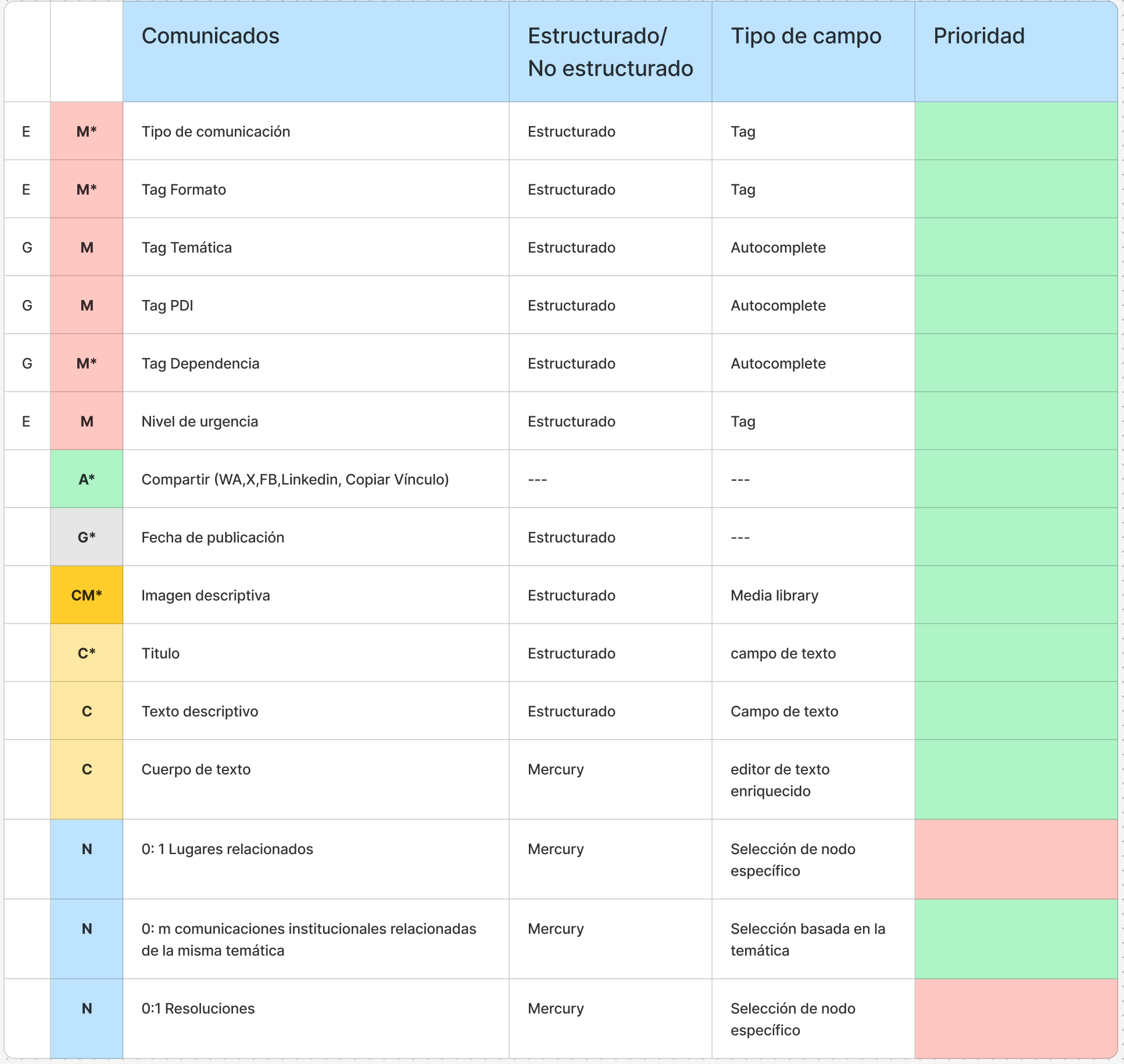
The hardest part of consolidation wasn't visual, it was ownership. Every unit was used to owning a site: their own URL, their own template, their own rules. Asking them to give that up would have stalled the project, so we reframed what "ownership" meant. Units stopped owning sites and started owning content. The platform's job was to take that content and show it to users wherever they actually needed it, whether that was a program page, a search result, or a call center script.
To make that possible, we used OOUX (Object-Oriented UX) to define the content model shared across the whole site. Content types were defined by a fixed set of attributes, similar to how developers define objects, which gave designers, developers, and unit stakeholders a common vocabulary and let decisions get made faster and with more confidence about how content would actually behave once it was reused across contexts.
Design Rationale
The decision to consolidate almost 500 sites into one platform came out of conversations with the people who actually ran those sites: unit administrators, admissions and financial aid teams, and the call center. What surfaced quickly was that the resistance wasn't about losing control of content, it was about losing the site itself, the URL, the template, the sense of ownership. We considered two easier paths: leaving every site independent and applying a shared visual skin, or centralizing all content authority under one web team. Interviews with faculty administrators and call-center transcripts ruled both out. A shared skin wouldn't fix the structural fragmentation behind inconsistent answers, and full centralization would cost us the buy-in we needed from units who weren't willing to give up their content. So we split the two: units kept ownership of content, the platform took ownership of the site. That reframing, backed by a benchmark showing unified university domains outperforming fragmented ones on search and findability, is what made OOUX possible as the next step. The trade-off was real: some units lost bespoke visual customization, and administrators needed time to learn a shared content model instead of a familiar one-off template. We validated the decision the same way we'd validate any product bet: deployment time per site, consistency of call-center answers, and direct follow-up interviews with the administrators who now own content instead of a site.
Opportunity Mapping
The opportunity didn't come from a single request, it came from four sources pointing the same direction: unit administrators asking for relief from CMS overhead, the call center escalating inconsistent answers, a competitive benchmark showing peer universities running on unified domains, and years of accumulated sites nobody wanted to keep maintaining separately. Plotting the options on an impact-effort matrix made the trade-off explicit. A shared visual style only was a low-effort fill-in that wouldn't move the needle. Centralizing content ownership entirely was high effort with a real risk of losing faculty buy-in, so we deprioritized it. Redesigning search on its own was a legitimate quick win, and we built it in as part of the larger initiative rather than shipping it alone. The unified platform, shared content model plus a genuine ownership shift, was the one strategic bet big enough to actually function as digital transformation rather than a visual refresh: it was the only option that fixed the structural cause of fragmentation instead of working around it, and it's what let the university's three core pillars, admissions and scouting, financial aid, and institutional voice, finally live under one reliable domain.
Quick Wins
Strategic Bets
Fill-ins
Deprioritize
Redesign search
Unified platform (chosen)
Shared visual style
Centralize ownership
Benchmark
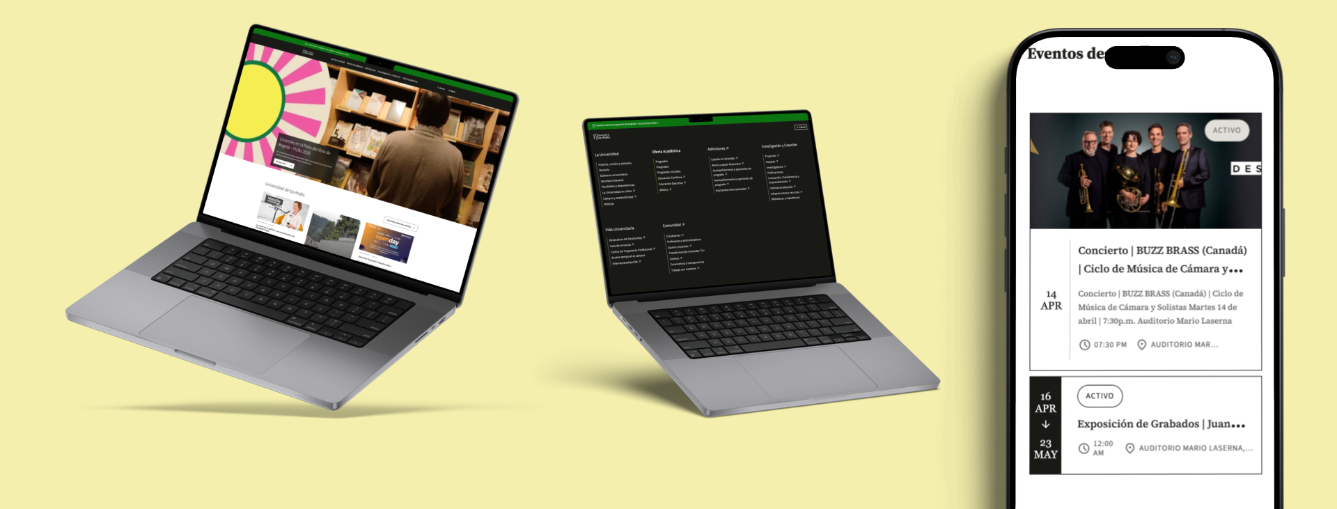
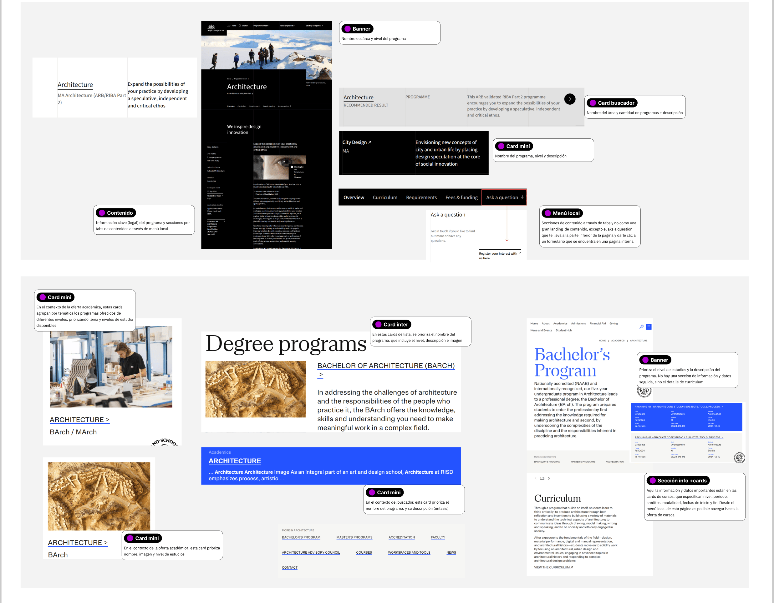
We looked at how other leading universities structured their web presence, across visual design, interaction design, and information architecture, to separate patterns worth keeping from conventions worth challenging. One concrete result was a redesigned search experience, since a site built to hold everything the university does needed a search engine and a search bar reliable enough to help users find their way through content that no longer lived in one predictable place.
Outcome
Centralizing under a single domain changed the economics of running the university's web presence, not just its look. Site administrators could stand up a new page using shared design system components instead of building one from scratch, which cut average deployment time for a new site from around six months to about one month. The CMS became easier to manage because content types and page structures were now consistent across units instead of custom to each one.
On the pillars themselves, admissions and scouting content, financial aid information, and institutional news now lived inside the same structure instead of scattered across separate domains. The clearest human impact was on the call center, where agents could finally give prospective students consistent, reliable answers about applications and financial aid, because that information had one home instead of dozens.